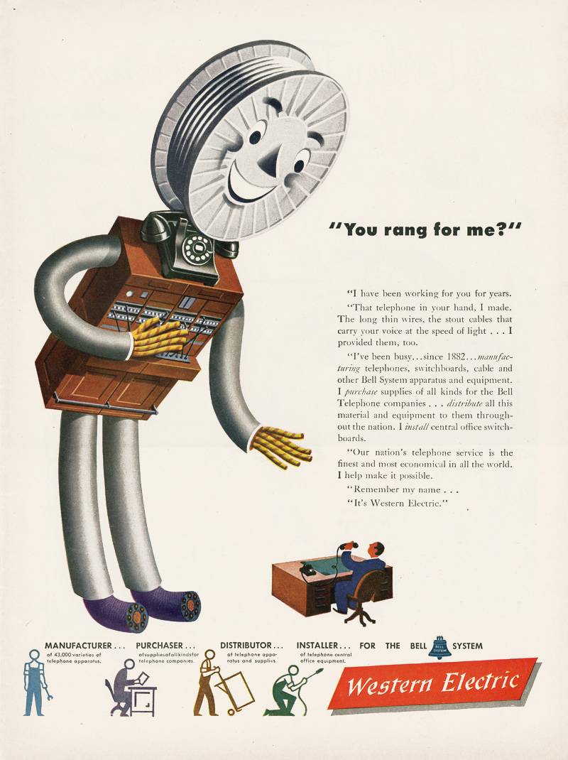
In the pre-television era, and into the early adoption period leading up to every home having at least one set, printed and radio advertisements were the only way for companies to relate to their potential consumers. I found that this ad from Western Electric, circa 1946 was a great example of the personalization principle. The personable and conversational tone paired with the friendly character of a helpful switchboard help to sooth and attract customers while informing them of the full role Western Electric played in the nation’s telephone service.
The audience for this advertisement was actually working adults and business people, which seems strange to me as a modern consumer. This is denoted by the man at the desk to whom the switchboard seems to be speaking. When I see smiling anamorphic things in an ad I generally assume it is targeted towards children, however in that time in the U.S.A. cartoons were still mainly for adults, shown before feature films at movie houses. The role of this somewhat creepy monster switchboard was to draw attention to the article which was most likely published in a business magazine or brochure.
The message was clearly intended to invoke trust and loyalty to Western Electric for business involving telephone services. This is where the personalization really comes into play, relating the company’s history and role in that field by speaking in the first person. The man at the desk is intended to represent the reader, invoking a sense that when calling for telephone services you should be speaking directly to this company. The ad describes Western Electric’s role in such service since 1882. The message also seems to be trying to relay the broad scope of services which Western Electric offers – perhaps the company was known for one or two of them and wanted to relay that others were available.
This ad seemed particularly apt since it also demonstrates another principle, that of segmentation. At the bottom of the page the designer broke up each role the company plays with a pictorial representation. This helps alleviate the daunting nature of the large block of text which tells the story in the first person, both to bring in those who might not have felt the urge to read all that text, and to help reinforce the relevant points for those who had. I really feel like it helped the flow of the ad and brought everything together, rather than crowding it or violating the redundancy principle.
I have a love for the American art of the 40’s and 50’s, and it seems that many pieces created at that time cohere to the same principles we use for visual design. This ad, through its use of a friendly looking character and casual text directed personally to the viewer, is a fantastic example of the personalization principle. Through the striking use of a anamorphic switchboard, the eye is drawn to the ad, and the first person dialogue makes the viewer think “What is this character saying to me?”